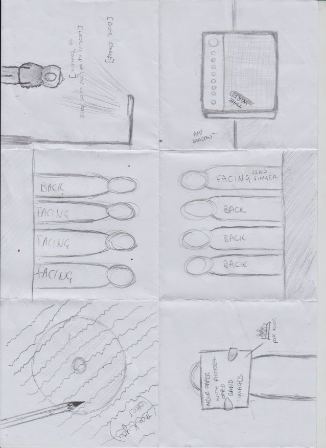
Thursday 25 September 2014

Shooting schedule


Website flatplan


After looking at several music websites, we decided to open our own with an enter site page which will link to our digipack and video by having an amp on the front with The Wired written on it in silver. To link with this, we'll have "enter site" written in a font to look like it's a wire- constantly linking back to the name of the band. This font will also appear as the masthead on the homepage to the website which will help create a house-style.
Social media will play a big part in the construction of our website for example, there will be a livestream of their Twitter account and a YouTube video embedded at the top of the page to entice audiences immediately. Instead of a page for photos, there will be a photo reel of the band, making them seem more quirky and different, also making them seem quite raw which links to the indie rock genre.
The more general layout of the webpages will take the form of the third image, which will also have the social media on the right hand side. This will give the website a social media base for advertising, but not so much to take away the main stories on the pages.

Digi Pack flatplan

For our digipack we wanted to have original 'indie' ideas to clearly signify the genre and the bands characteristics. We decided that it was important to have a track-list and a thank you page as well as the typical band shots found on the digipack, as we felt this would make it more realistic. We also decided that at the back there shot be a shot of the band but with their backs to the camera, so that they aren't using direct mode of address, as we felt this was associated more with pop music. However we thought in order to make it less cliche and typical, we would have the main singer facing the wrong way (towards the camera) just to break the typical conventions. This then lead on to the idea that we could have the same image but in reverse (the band members facing towards the camera but the lead singer with his back to the camera) on the inside of the digipack. Then when you open up the digipack in full you have a 360 degree shot of the band.

We decided that instead of the tracklist being typical and just printed on the digipack, we thought we could make it look as though the track list had been graffitied onto the pavement in front of the band. The thank you's will be sprawled over the CD area of the digipack so that it could only be completed with the CD in place. There will also be the pen photographed on top as though they have only just written it. The final to parts of the digipack will be photos of the band. One is of the lead singer only, underneath a street light with low key lighting, dark mise-en-scene and his trademark hat. The last part is going to be one of the band members holding up a newspaper, however the article sections of the newspaper will actually be photos of the band, in different locations, angles, shots and costumes.

Model Release Forms


Call sheets

Location recce and risk assessment

Animatic


Animatic from Ellie Williams on Vimeo.

Storyboard

Sketches of set design / construction of test shots


We decided that we wanted our video to be set in three different places: in the studio for the performance shots, in the hotel and around town. We have roughly sketched out studio set up, which will be a plain white back drop and floor, with the instrument and band being in black for sharp contrast which makes them stand out. The lighting will fairly neutral and we may have white spotlights focusing on each of the members.  We will have the bassist on the left, the drummer central back, the singer central front and the guitarist right. We are also going to have two amps one placed with the bassist, one to the right with the guitarist, creating the edge of our frame. We plan to create the white back ground by using the photography back drops, pinning two of them together in order to make it wide enough for the frame. We plan on getting this backdrop from college. 

The hotel shots and outdoor shots will not need any extra set design as this is out of our hands, however we may have to consider additional lighting and exposure to make sure that our members can be seen and we make effective use of shadows and silhouettes. We will plan this when we are on location doing our test shots. 


Monday 22 September 2014

Ideas for cut aways

We decided from the very beginning of the process that we did not want to have cut aways that included narrative. Therefore we needed to think of some ideas to use as our cut aways. We decided to look at a variety of different videos for inspiration and this is what we came up with:


  • The band stood against a plain wall and graphics being projected onto them. (The XX - Crystalised)
  • 'Behind the scenes' shots of the band - loading, unloading, setting up, tuning etc
  • More personal shots of the band - chilling & down time
  • Blooper type footage  such as 'Girls by The 1975'
  • Using the split screen idea as a cut away 
  • Random urban location shots with and without the band 
  • Plain graphics on their own 
  • The band performing but in different locations (outdoors, in the middle of the street, in a field)
  • Use of lighting and shadows to create contrast from the performanc

We decided that in our video we are going to:
  • have random but choreographed footage of them being carefree and portraying the cheeky, energetic persona of the band
  • we also decided to have footage of the band walking around the town, again having fun and connoting the upbeat tempo of the music
  • we decided the more 'random' footage we have the easier it will be to create the quick editing pace by cutting between the different locations and footage 
  • the first lot of cut aways will be the band setting up their instruments
  • we decided that we are going to ask for permission off the local hotel to let us use one of their rooms, one of the hall ways and possibly their 'backstairs' to film footage of the band having fun and chilling in their room. One of the ideas was to have the band running down the stairs of the hotel, maybe writing in their hotel room, and just generally chilling in the hotel
On the 22nd of September we contacted The Kings Head Hotel in Darlington to inquire about possibly using one of their rooms, and corridors for filming, They got back to us to confirm that they are happy for us to do so and we need to ring back with dates and times. We plan to do this by the end of this week. 

Thursday 18 September 2014

Individual Research

Digipak:

Mainstream vs indie:
One main feature that can be seen throughout all the indie album covers compare to the mainstream covers is that the artists or band isn't as prominent on the front cover. On mainstream digipaks the key focus is on the artist, making sure they are the key feature of the frame and that all the attention is on them. Usually there is also more picture of the artist inside the digipak as well.

The pictures is usually a close up and really connotes the genre and the artists persona. For example both the Demi Lovato and Taylor swift photos are quite gentle and delicate. Their make up is light and feminine. Their hair is loose and wavy suggesting a natural feel to the images. The lighting is also high key and brightens the images.

However Jessie J's cover is the complete opposite, despite it being still in the mainstream category. The image is still a close up and makes her dominate the frame, making sure she is the main focus of attention. However it is clear she is trying to portray a completely different image to Taylor Swift and Demi Lovato. Her image is much more fierce and powerful. The dark make up and clothing harshly contrasts the white background suggesting she isn't as innocent as the others. Her straight jet black hair is the complete opposite to the 'natural' look that the other pop artists often try to present.

 The bright gold title is also the complete opposite to the others titles as well as Taylor Swift's and Demi Lovato's are quite subtle and blend in. However Jessie J's title is much more in your face really grabs your attention. Suggesting that the artists is really wanting to make an impression.

The McFly album cover is much different as it may be trying to appeal to a slightly different demographic. As they are a four piece band the label may be trying to represent them all equally. Therefore they have used the same size close up for each member. Subsequently not one stands out more than the other. The cartoon drawings of mouths connotes a slightly more playful and carefree side to the artist. The title again stands out quite a lot as it is placed in the centre of the frame. This draws the attention to the bands name. They also use the title as the source of the lighting, as the title spreads its light over the bands photographs, connoting the title of the album 'Radioactive' as it looks like a radioactive glow.

However the Indie covers are much different. All of the album covers I selected did not include the artist or band on the front cover. I feel like this is an important feature of indie covers and we should thing about this when creating our digipak.

On indie album covers there is usually either:
A photo that represents the album name or the artist.
A completely random photo that does not necessarily directly relate to the album or artist.


 For example James Bay's album cover is a sketch of him and his trade lock long hair and hat. For fans of James Bay this would be instantly recognisable and therefore there is no need for a set up close up of him, like the ones used on the mainstream covers. Due to the differences in target audience's there is a difference in the types of pictures used. Younger fans are more likely to be attracted to the image and persona presented by artists as well as their music. However a slightly older audience is more likely to just be attracted to the music alone.

The title is fairly plain but also a key part of the frame. Again due to the target audience there isn't any need for it to be extremely prominent and attention grabbing.

Similarly the Newton Faulkner album does not feature him on the cover. However it does reflect the title of the album 'Hand Built by Robots'. The slightly quirky album cover grabs the audiences attention but in a different way to the mainstream covers. The cartoon drawing almost reflects a deeper meaning and suggests a possible tone of the music. Again the title is subtle but carries out its job sufficiently.

This can be inspiring when we create our digipak, in that we can take the name of our album to create an image rather than using our band members. The quirkiness of the image is quite common in the indie / rock genre, so we should consider this in our products. Furthermore we could follow the James Bay cover and use an outline of our band rather than a clear close up of them. This would suggest that they are an indie band but may also be trying to appeal to more of a mainstream audience as well.

The Ben Howard and Coldplay albums are slightly different as their main images are not necessarily directly linked to either the artist or the album name.  However they may suggest the type and topic of the songs that will be present on the album. The images may be more about their inspiration rather than trying to appeal to the audience. We could use this in our album cover by trying to reflect the bands inspirations and deeper meanings of songs rather than reflecting the bands attitudes and personalities.


Videos:

The main different between mainstream and indie videos is the budget. Mainstream usually have a much higher budget and there for have bigger spectacle. Meaning they are more impressive to view. Whereas indie videos have much lower budgets so therefore have less impressive costumes and location so subsequently will probably have a simpler concept. A good example of a high end, high budget, mainstream video is Taylor Swifts 'Blank Space':

This video is clearly mainstream due to the impressive locations, props and costumes. The fancy cars and huge manor that establish the video are an instant signifier that the video will offer pleasing visual spectacle. This will be the key feature of the video and what will make it entertaining, rather than a complicated plot line. The video also clearly incorporates Andrew Goodwins theories of a successful mainstream music video, which are:

  • It will demonstrate genre characteristics - this is done through the mise-en-scene, mainly through costume choice and location and setting. The editing also fits within the typical genre tropes of pop and the lighting is fairly high key, suggesting a light heartedness about the artist. 
  • Lyrical representation through the visuals - this is done through the characters mouthing the lyrics as if they are conversing as well as Taylor being seen carving their names into a tree as the lyrics sing 'I'll write your name'. Furthermore on the lyrics 'i can show you incredible things' the visuals cut to a large white bedroom with an impressive four post bed and two live white horses stood either side. 
  • The tone and atmosphere of the visuals represent that of the music - this is achieved through a light hearted love story at the beginning as the music is light and follows the pop genre, however we are then shown the relationship take a turn as the lyrics change to talk about the break down of the relationship.
  • The demand of the record label will include many close ups of the artist - There are a lot of close ups of the artist, in different costumes and at different angles. As well as this she is in almost every scene. Therefore she has the majority of screen time and is often the key focus of the frame.
Although we do not have the budget or equipment for a mainstream video like this one, we can make sure that our video is appealing, professional and may appeal to a mainstream audience by incorporating Andrew Goodwin's theory into our product.

In Indie music videos the budget is often a lot lower and so therefore the concepts have to be much simpler. An example of this is Ben Howard's "keep your head up":

In this video the narrative is very basic, they are seen building a water slide out of haybales and then sliding down it. They only use one location, costume and there is no real story. However the video is still entertain and attractive. The spectacle this time is the use of framing, creative shows, imaginative use of lighting and shadows, and the fun / lightheartedness of the video that has a tone matching that of the audio.  The use of bubbles to break up the shots and frame are simple, low budget but extremely effective.

This is extremely important for when we come to create our video. We should bare in mind that sometimes the simple ideas are the most effective. Even with plain locations and a simple concept, with creative shot composition and natural cut aways the video can still be professional and successful.

However taking this idea we would need to make sure it still fit within our chosen genre of indie rock. We could do this by using an urban location rather than a rural one, use a darker colour scheme and low key lighting, carefully select our costumes making sure they were dark and typical of indie rock artists and change the editing pace to make sure it fits our chosen audio as well as the genre.

Website: 

After looking into different music websites I realised that whether it was mainstream or indie, they are all similar and aim to have the same effect. All included features such as music player, merchandise page,  tour dates, bio page, pictures and videos and links to social media. However similarly to the digipak the main difference of the two types of websites is the focus.

In mainstream websites the focus again is on the artist and the image they are trying to present. There are a lot of images of the artist and often the website has the same colour scheme and fonts as the artists most recent album. The key focus is usually on a music video which is placed on the home page. Big mainstream artists like One Direction also have a 'private' are of the website that only subscribed fans can access. These areas often include exclusive content such as unreleased photos and videos, previews of up and coming music and pre-access to tickets.

However Indie websites are usually slightly more basic. They do represent the genre however they usually stick to the general features of a website. Their focus may also be more on the products rather than the artist. Often as you enter an indie website their is a front page before you can reach the home page. This front page usually advertising an upcoming tour or new release. This is due to indie artists making most of their profit from live shows.

We should consider this with our website making sure that for it to clearly represent indie rock it contains the key features. We could also include a front page and make sure that it uses the same colour scheme, images and style as our digipak.


Wednesday 17 September 2014

Research - location and set design


The Kings Head Hotel 


22 Sept - We called the Kings Head Hotel in Darlington at 10am and are awaiting a call back from the Manager 

22 Sept - (Evening) Hotel said that we were welcome to. We have to get back to them with dates and times, once we have discussed as a group to see which is viable for people need for filming (pref all group) 


If this doesn't fall through here are a list of alternative hotels which we will keep for backup;


It is unlikely that the larger corporate hotels will allow us to use their business for filming purposes, but If the Kings Head doesn't allow us to film we always have these for   


Darlington Town Centre

  • 'Random Shots'
  • Walking together
  • Water fountain?


Train Station

  • Establishing shot
  • Group/ band stood at top of the stairs
  • Tracking shot down stairs- gradually zoom out - walking on clap of beat
  • Filming in the bypass tunnel on the clock side
  • Over bridge on the main entrance


Dance Studio 

We have booked out the dance studio to film our band shots (below are the time sheets where we have booked two shoots Ellie, Lauren, Anouska). We have tests shoots planned using white fabric to completely to cover the back wall and floor to maintain consistency.


Costume & Props


We've looked at various costumes used by real indie bands and fans of the genre to help us decide how to reflect the genre in our own products. We've decided to dress the band in dark colours, mainly consisting of black and some leather jackets as it's a common feature of indie rock. They usually also wear skinny jeans with either converse, black shoes or boots which we can incooperate into our own costume design. They also usually wear patterned t-shirts or predominantly black shirts and also sometimes wear black sunglasses which we would like to mimic.
We've also looked at a few more of The Fratellis videos and seen that a recurring feature throughout is that the lead singer usually wears a top hat, our idea is to mimic this and have our lead wearing a top hat or a fedora.
Before deciding on what we want for our costumes, we are going to get our "band" together and see what costumes we have between them and try and work with that before looking for other costumes.


Additional Research

Cinematography, mise-en-scene and editing:
  • black & white 
  • low key lighting 
  • dark clothing, mainly leather 
  • extreme close ups of instruments 
  • close ups of band - usually lead singer
  • use of shadows and silhouettes 
  • images that make use of vertical detail with horizontal writing over the top usually stating the band and their song
  • performance based shots 
  • aerial shots of the band
  • cut aways usually featuring the band 
  • slight use of humour but very subtly 
  • use of mirrors or reflections 
  • effects and graphics to add something to different to the video
  • long establishing shots 
  • lighting and projectors, shining onto objects 
  • serious facial expression 
  • hints of colour - either through lighting or miss-en-scene

Pitch Feedback and reflection

Feedback that we gained from our pitch was:


  • we needed to make the bands image clearly, making them either grungy and only grungy or fun loving. 
  • make sure that we were clear as to what our cut aways were going to be and make sure that they made sense as well as fitting in with the genre. 
  • think about how we would incorporate colour. Originally we said that the whole video would be in black & white. However after discussing with the class and gaining feedback we decided that we should incorporate flecks of colour. The class then began to think of ideas on how we could do this and came up with the idea of them wearing coloured t-shirts. 
  • make sure that our editing pace reflected the song 
  • we needed to make sure that the video was exciting enough and had enough variety to keep the audience interested
  • think a little more in detail about costume, make sure it fit into the genre and reflects their characters 
  • make sure we have a variety of shots, at different angles, distances and pans

Thursday 4 September 2014

Primary Audience research

I decided to talk to some people who would fit into our target audience for an indie/rock music video.
I asked them:

What they like/ dislike in indie rock music videos?
Their favourite indie/rock artists?
Do they prefer narrative music videos or performance videos? why?
Do you have a favourite music video?

Toni- Nicole Kelly, 17:

Likes/ dislikes: I like when its not just performance and when theres footage of other stuff. I also like it when there is some sort of humour / narrative in the video. I dislike it when the personalities of the band don't come through in the video, i like them to be charismatic.

Narrative or performance: I prefer narrative videos as they keep my attention better, if the video is just performance i like it when there is footage of other stuff put in as well.

Favourite indie rock artist: The 1975

Favourite music video: Girls - The 1975 because they take the mick out of typical, over bright pop music videos. I like the swap between the 1975 and the girls and the comical and humours side to the video.


Abi Walker, 18:

Likes/ dislikes:   I dislike plain lyric videos because they are boring to watch as there is nothing else going on and i don't watch the videos to learn the lyrics, i usually already know the lyrics anyway.

Favourite indie rock artists:  Arctic Monkeys, Kasabian, Oasis

Narrative or performance: My favourite type of videos are live videos or filmed as if they are live because it is more atmospheric and i prefer performance videos for the same reason.

Favourite music video:

Wednesday 3 September 2014

Pitch

Rough design of website


Rough design of digipack


Timeline of track


Synopsis of music video

After looking at a number of indie rock music videos we decided that we should create a performance based music video. We decided we should also include some form of cut aways but not to any narrative  based shots, the cut aways should also be the band. Towards the middle and end of the video we decided adding split screens will pick up the pace which we decided to do after taking the advice of Jake Wynne to 'leave something big and different till the end.' We got the split screen idea from the music video It Gets Cold by Eliza and the Bear.

We thought that the footage should be in black and white as this is very stereotypical for indie rock which helps to really reflect the genre. The video will include a large a amount of close ups of both the artist's and their instruments. However gradually as the video progresses the shots will get wider and wider until eventually we have the full band in the shot. As we then introduce the split screens we will then re-introduce the close ups. Jake's advice was to start with establishing mid to long shots. However we decided to reverse this concept to add the 'indie' / 'alternative' feel to the video, creating something that the audience might not originally expect. However this change isn't so significant that it would stop the video appealing o the target audience.

They will be dressed in darker clothing, typical for the genre. They will be wearing leather and skinny jeans, very typical clothing. This will contrast the completely white backing making the artists stand out and the focus of the audience on the band.

The lighting will also be low key to help enhance the grungy feel of the video. However we will have spotlights on the artists to make them stand out. Due to us having the footage in black and white we will have to make sure that we do a few test shots in order to make sure the lighting is correct for when we turn the footage black and white in the editing stage. We will have to make sure that the lighting doesn't make them too pale so that they blend in with the white background and also make sure that they are not too dark so that we can't see their faces.

We will have a full set up of cameras to be able to gain a large variety of shots. The camera set up will include:
- one track
- one dolly
- one fig rig
- one fixed


Pinterest of chosen track


Letter to Music Label

To whom it may concern,

My name is Ellie Williams and I am currently studying A2 Media Studies at Queen Elizabeth's Sixth Form College in Darlington, United kingdom.

I am writing to ask permission to use the song Creepin' up the back stairs by The Fratellis to create a music video for educational reasons that will be uploaded to a public forum such as YouTube or Vimeo. 

Thank you for taking the time to read my letter and I look forward to hearing form you soon.

Yours Sincerely,

Ellie Williams 

Chosen track


"Creepin Up The Backstairs - The Fratellis"

She said "I'm Rosie"
I said "I thought you were Lucy"
She said "No Rosie, I told you so"
Was here with your sister
But she's going out the back
I wanna dance and have fun you know
Of all the shitty little places I meet you it's here
And I'm freaking out
I heard you got a brand new name
Selling Es in the dark
But hey it's nothing to shout about

Don't just say yes to tease me
Do your utmost to please me
I don't mean to be sleazy
Being you can't be easy

When you're creepin' up the backstairs
Mother's nightmares
Falling in the front door
My my
Climbing in the window
Get dressed, let's go
Take your brother's car keys
Bye bye

Well I see your yellow fingers
And your crucifix bones
All covered in cellophane
Was there when your best friend said
"Sweetheart, I'm just here to get drunk again"
I wouldn't move if I was you
I wouldn't wanna caught when the lights go out
She said "You think you're so special"
I said "Sunshine I'm just just bored I'm just checkin' out"

Don't just say yes to tease me
Do your utmost to please me
I don't mean to be sleazy
Being you can't be easy

When you're creepin' up the backstairs
Mother's nightmares
Falling in the front door
My my
Climbing in your window
Get dressed, let's go
Take your brother's car keys
Bye bye

Don't just say yes to tease me
Do your utmost to please me
I don't mean to be sleazy
Being you can't be easy

When you're creepin' up the backstairs
Mother's nightmares
Falling in the front door
My my
Climbing in the window
Get dressed let's go
Take your brother's car keys
Bye bye


It took us a while to decide what track to do. We finally agreed on this one by The Fratellis because it was up beat, very obviously indie rock and inspired us for plenty of ideas visually. The other tracks that we looked at included some from The strokes, Eliza and the bear and Kings of Leon. However we decided against these due to a number of reasons including: being to slow, not having enough variation musically, not being indie enough, not rocky enough and not giving us any ideas and inspiration visually. 'Creeping up the backstairs' was the best track we decided as it was a fast tempo which made it exciting and gave us plenty of opportunity for a quick editing pace and lots of shots. 

Possible tracks


Pros - it is up beat which allows for high energy performance and quick editing pace. There isn't any strange instruments and it is a band, therefore there is more artists to perform giving us more opportunity for a variety of shots.

Cons - It isn't as rocky/ indie as we had hoped, it starts slow where we wanted it a bit more upbeat from the start. It doesn't save anything till the end, the video as inspiration has cut aways to narrative which will be difficult for us to do making it look professional.


Pros - it has a steady beat which will be good when it comes to editing our video as we can easily cut on the beat. The music is by a band which is what we wanted so that we have more performers. The song is upbeat from the very beginning but it also has ups and downs which will give us opportunity to have a variety of shots and tempo in our footage.

Cons - It isn't as rocky as we originally intended, it was slightly more indie/ pop. They aren't as grundgy, they are more upbeat.

Tuesday 2 September 2014

Target Audience


This has affected how we will create our promotional products. We will take into consideration what our target audiences' likes and dislikes are in order to create products that will attract and interest our audience. For example we will not use pop like fonts, bright colours or artists that are of the mainstream pop genre. We will try to use more grungy, darker colours that are likely to attract their attention. I think our target audience will be older teenagers and people in their 20s and predominantly male.

Therefore we are likely to put a photo of the band, not using direct mode of address, on the back of the digipack rather than a close up of them breaking the fourth wall on the front as this is typical for pop albums.

The target audience will also effect the location that we use. Indie Rock videos are usually in urban areas, backstage areas or in studios and stages.

The colours are usually black and white or using very low key lighting. No bright colours are used and the artists are often wearing black and leather.

Inspirational music videos

- Kasabian
- Franz Ferdinand
- The Black Keys
- Bastille
- The 1975
- The XX
- Arctic Monkeys
 

The 1975 use the codes and conventions of indie rock as their whole video is in black and white using low key lighting. The video is set only in a studio and uses effects to create cut aways from the performance footage. The bands performance is typical to the genre as well, staying very serious and not putting much pep into it. The video also contains a female in an light that would attract the predominantly male audience. The editing fits with the audio giving the video a laid back feel. It doesn't have a complex narrative like the typical mainstream pop videos which again is more likely to attract the target audience rather than a younger audience.


Kasabian also use the codes and conventions of indie rock by having the whole video in black and white. It has a grundgy feel to it through the costume choices of dark clothing, leather and skinny jeans. The serious body language and facial expressions also help to add to the grungy/ indie rock feel as they do not use have a pop/ upbeat feel. They use all performance footage and use effects instead of having cut aways to narrative which is typical to the indie rock genre. Furthermore they use close ups of the instruments and the artists faces which is useful for the audience identification. However they do not use a friendly direct mode of address. The video follows the rhythm and tempo of the music which is also typical for indie rock genre.

Chosen Genre

Our chosen genre is Indie - Rock.

The forms and conventions of this genre that we will include in our videos are:
  • Fairly dark, grungy lighting 
  • moody body language
  • No bright colours 
  • effects 
  • Live performance footage
  • cut away to narrative
  • retro 
  • Extreme close ups & close ups of the artists 
  • Low key lighting 
  • Cutting on the beat and the editing pace following the tempo of the music
  • Laid back, casual clothing usually dark clothing 
  • location is usually urban 
  • Some shots on just a stage or in a studio 
  • A lot of indie rock footage is in black and white

Genre Research