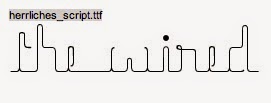
To create our titles we first went onto Dafont.com and search for wire looking fonts. These are to two we found:
After discussing our options with the two fonts we decided on the second one 'herrliches_script' as it gave us more opportunity to edit it and add effects.
We then started playing around with different options:
We then decided this one was our favourite as it was darker and more indie rock like however the flare of blue still added slight colour. We also felt it looked the most wire like as the red ones reminded me of an illuminous sign.
After deciding we like this title we wanted to have a go and creating the swirling wire either side of the title:


No comments:
Post a Comment