Thursday, 16 October 2014
Wednesday, 15 October 2014
Tuesday, 14 October 2014
Creating a title
Our first job for creating our website was to create a title that would be the most eye-catching part of the website. We decided quite early on that with our band being called The Wired we wanted the title to look as though it had been made out of wire. Furthermore we wanted a glow around the title to look like an electrical current. We thought we could then have the wire coming from both sides of the page to meet in the middle, creating the letters.
To create our titles we first went onto Dafont.com and search for wire looking fonts. These are to two we found:

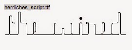
After discussing our options with the two fonts we decided on the second one 'herrliches_script' as it gave us more opportunity to edit it and add effects.
We then started playing around with different options:


We then decided this one was our favourite as it was darker and more indie rock like however the flare of blue still added slight colour. We also felt it looked the most wire like as the red ones reminded me of an illuminous sign.


To create our titles we first went onto Dafont.com and search for wire looking fonts. These are to two we found:
After discussing our options with the two fonts we decided on the second one 'herrliches_script' as it gave us more opportunity to edit it and add effects.
We then started playing around with different options:
We then decided this one was our favourite as it was darker and more indie rock like however the flare of blue still added slight colour. We also felt it looked the most wire like as the red ones reminded me of an illuminous sign.
After deciding we like this title we wanted to have a go and creating the swirling wire either side of the title:
Tuesday, 7 October 2014
Digipack Research
The Killers:


Many of The Killers' digipacks are in black and white which give a moody vibe to them as artists. A lot have things quite abstract such as the goat and the editing of the photos that makes them look like they are floating. This intrigues the audience and draws them into the band because they use abstract methods to create enigma. They mainly wear black regardless of the black and white images, also helping to create a moody vibe along with the lead singer wearing sunglasses which draws in the audience. The lighting is often dark even though most of the images are shot outdoors, again giving a moody vibe.
From this we could use some of their methods, however some won't suit The Fratellis' (The Wired) style of music as our song for the video is fairly upbeat and fast paced. From this, we could take some of the locations as many are outdoors throughout this research. This would mean that we'd need some outdoor locations to consider using. The costume would also be ideal for us and we will have to think about what style- many of these bands use dark or black clothing so that is something we will consider across all of our products.
The Kooks:


The Kook's digipacks use similar methods to The Killers, they are all in black and white but they also have different colour fonts, red and yellow, for the names of the albums. These carry connotations of danger generally making them out to be quite exciting, even though the photos are in black and white.
From this we could think about the different coloured writing and how it has an effect and creates an image for our "band", this could mean that if we used red for the album title, then it would make them out to be a manic band, which also ties in with the song we are using.
Kaiser Chiefs:


The interesting thing about the Kaiser Chiefs' digipack is that the images link well with the title of the album. "Ruby" links with the red of the image and "Souvenir" links to the rock in the sense you give it to people as a souvenir. They cleverly hint at the album with what seem to be abstract images, though when looking closely they have clearly been thought about in detail.
For our own digipack, we could also copy this method, we could have an image on a set of stairs to link with the song title "Creepin up the backstairs".
The Black Keys:


The Black Keys are fairly abstract in their digipacks and many have graphic images opposed to photographs. Again, these graphics often link to the titles such as "Turn Blue" with the red and blue swirls. Abstract images are often used, like the drum kit and the effectiveness of the drum kit forces audiences to look at their name as it is in a big font and takes up the majority of the cover.
This shows that in out own digipack, we will need to consider the placement and size of our fonts and decide what is more likely to be effective.
Franz Ferdinand:

The Franz Ferdinand cover uses a lot of graphic design but it's also mixed with a photo of a woman shouting. The graphic design is effective because it makes the woman look as if she's shouting the band's name, having connotations that they are a popular band. This also makes them seem like a quirky, fun band.
This would be ideal for our digipack as it shares similar vibes as our chosen song. The graphic design mixed with the photography is also very effective so we may consider using it to our advantage when designing our own digipack.
costume and props test shots
For our lead singer we decided he needed a signature piece of clothing or costume to make him stand out. Therefore we got a fedora hat, making him a little bit more noticeable but still fitting into the indie rock genre. We also tried him in a few different leather jackets to see which he looked best in. The other band members we just wanted in plain clothing, skinny jeans, trainers, plain or logo'd t-shirts etc. Nothing too bright in colour but with some sort of detail. Here are our test shots for costume and props:


Subscribe to:
Comments (Atom)